
How to Paint 5 Value Scale
Value Scale in art is referring to the "range" of how dark and/or how light the colors within your composition. More values in between the two extremes of black and white offers you a more smooth gradation making your art look more realistic.
As the light in your setup touches the object illuminating and revealing the lightest value, as the object turns away from the light the mid grays are revealed merging into the dark values into the shadows.
Lets enjoy making a step by step simple 5 values scale that will allow you to understand the structure of light and shadows and mix clean 5 values from black to white.
STEP 1 - DRAW THE SCALE
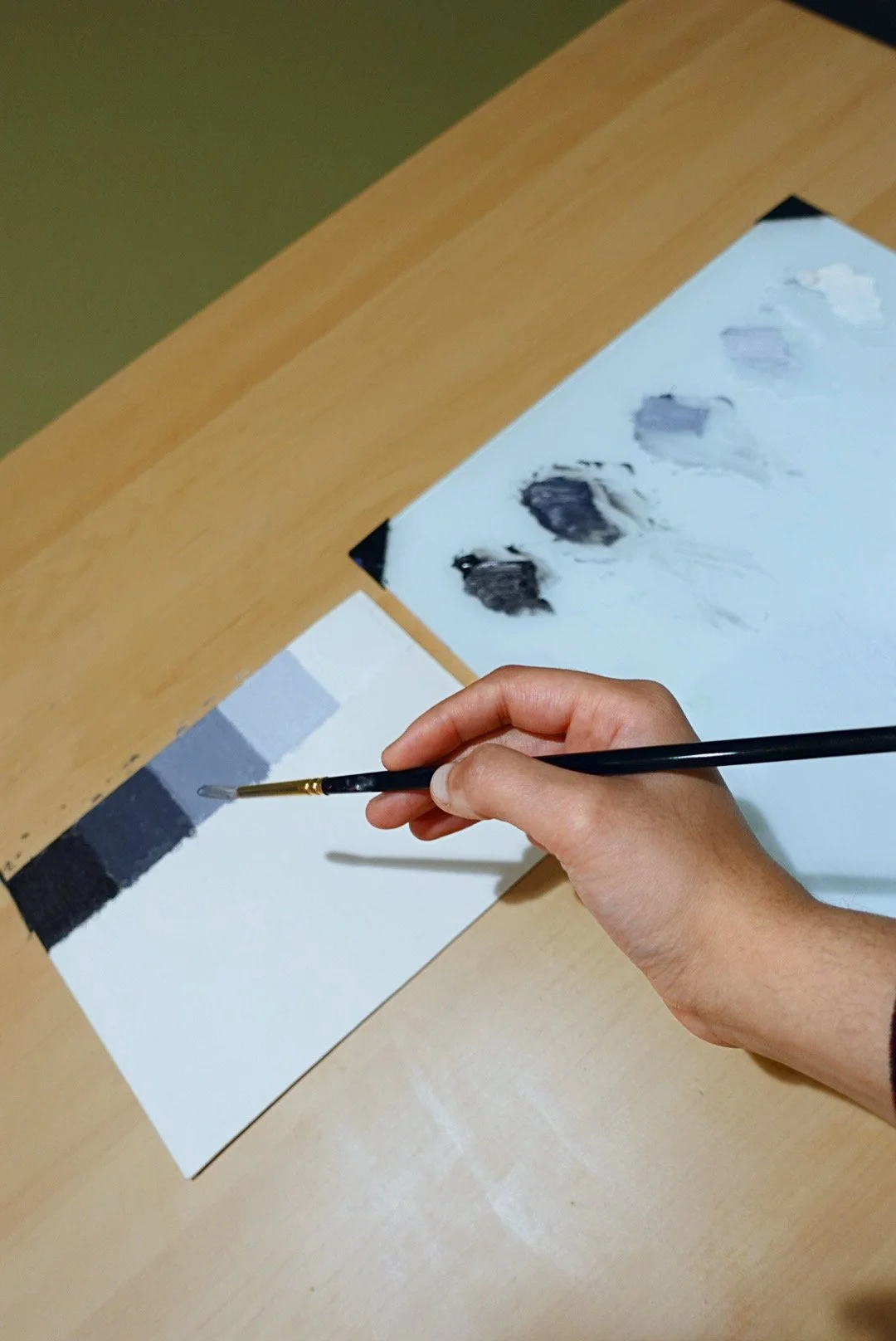
Use a canvas or oil painting paper to make your value scale
With a pencil and scale draw 5 equal boxes on the painting support. (You can draw boxes of 1 sq. inch or 2 sq. inch)
The reason we are beginning with a simple 5 value gradation is to find a balance that encompasses the entire spectrum from your darkest dark to the lightest light. This balance of value scale allows you to notice the clear difference between each value
STEP 2 - MIX THE MID TONE
In oil painting, your whitest white is going to be your white paint. Your darkest dark will of black
Squeeze out Titanium White on one side and Mars Black across the opposite side on your palette
Feel free to replace your white and black with any other pigment available to you such as Chromatic Black or Ivory Black etc.
With a clean brush paint black into the extreme left box on your value scale, similarly with another clean brush paint the white into the right side box on the value scale
NOTE - Some artists and teachers slightly tint their pure white with a hint of gray, whereas some keep the pure white on the scale. You are welcome to experiment :)
Either with your brush or with a palette knife, mix a middle gray (Value 3) in between black and white that is not too dark or too light
With a clean brush paint your mid-gray (Value 3) into box number 3 in between your black and white
If the mid gray leans more towards either side of black and white, feel free to adjust it by either mixing the black or white into it to bring it to a neutral mid tone gray
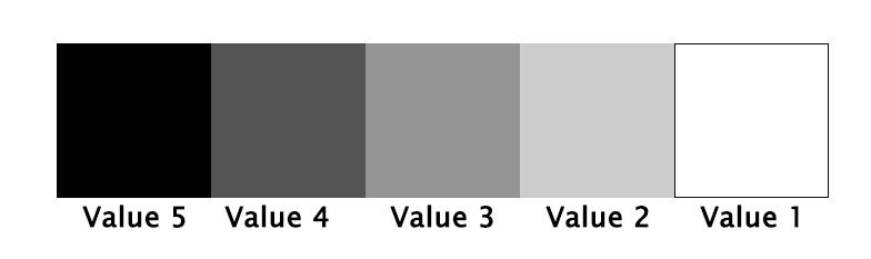
5 Value Scale
STEP 3 - MIX LIGHT AND DARK GRAY
Once your mid-gray (value 3) is set that’s when the fun starts!
Mix your Value 2 (Light gray) with the mid gray and white and paint
Likewise, mix Value 4 (Dark gray) with the mid gray and black and paint the final box on your scale
Keep practicing mixing and matching your grays to the scale to see really how close you are
The value scale is such an empowering tool ensuring your work will look realistic as you keep the lights and shadows into their corresponding value family. It is a fun and important skill you want to develop as an artist. Master your value scale and feel free to expand the 5 values to 9 values by simply adding a gray in between and you will certainly notice a huge difference in your artwork.
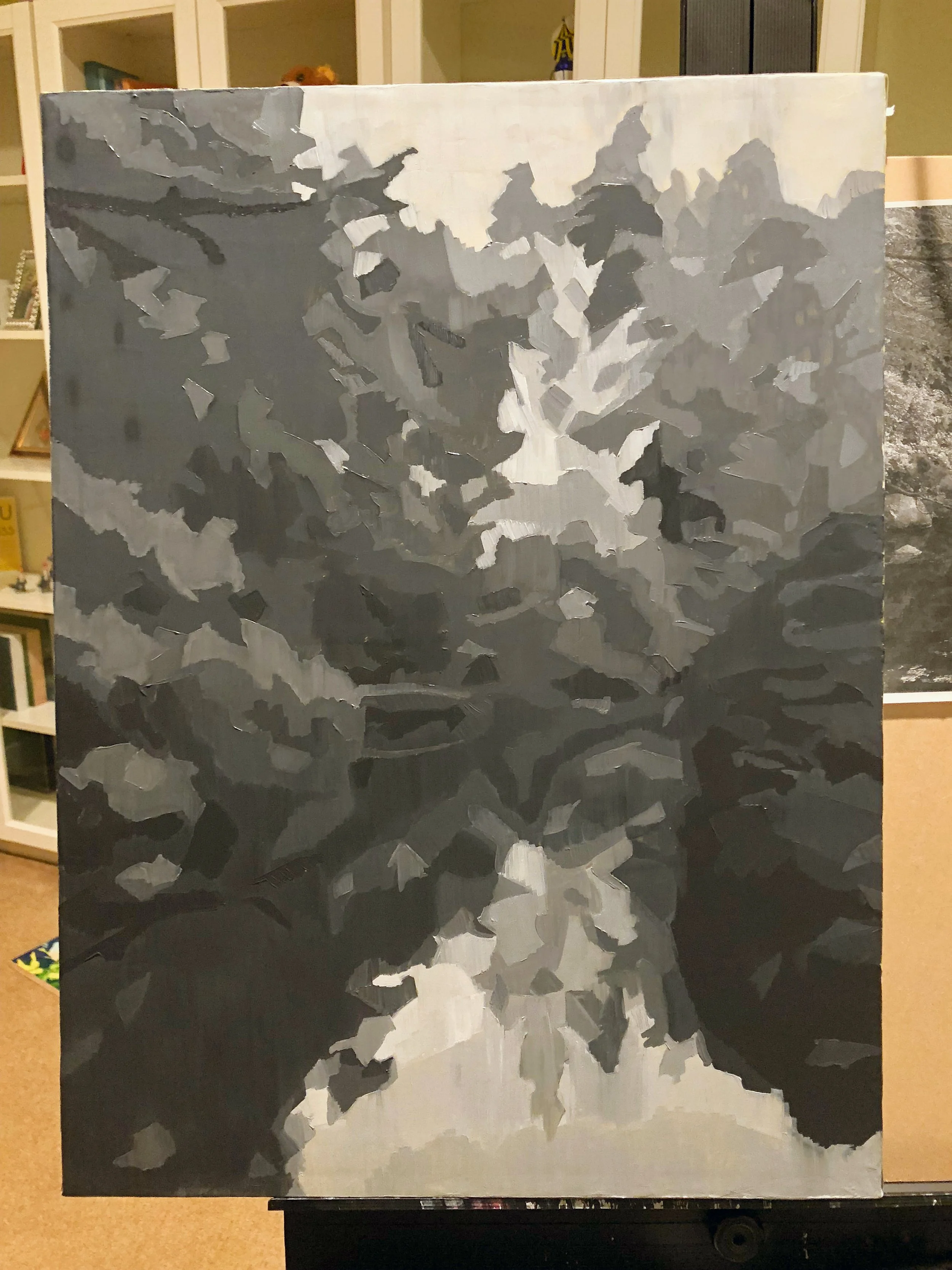
I simply LOVE how the colors are dancing within this composition! 💙Well, the value structure is the choreography that’s letting the colors dance happily! 🌈
Values are an inherent component of the color, always ask yourself how the values are arranged. It brings me joy to share the development stages of this painting where I began it with the light, dark and the midtones value pattern 🖤🤍
I reserved my lightest light (Value 1 and Value 2) for the Yellow tree that is catching the light and I used my darker Value 3, 4, 5 into the Blue-Green vegetation into the shadwos.

Congratulations on making your oil painting value scale! It looks beautiful! Isn’t it a beautiful feeling to go back to basics to refresh and renew these simple concepts?
Enjoy painting your value scale and please reach out via the comments below or contact form for any questions you may have! I would love to see your value scales.
ASHWINI